Themes, identity & motion
<SipPhone theme={{ appearance: "system", // "light" (default) | "dark" | "system" preset: "ocean", // forest (default) | ocean | midnight | graphite | sunset | lavender accent: "#285dab", // any token overrides the preset answer: "#1e9e4a", // answer and call buttons controlShape: "rounded", // "circle" (default) | "rounded" radius: 24, fontFamily: "Inter", }}/>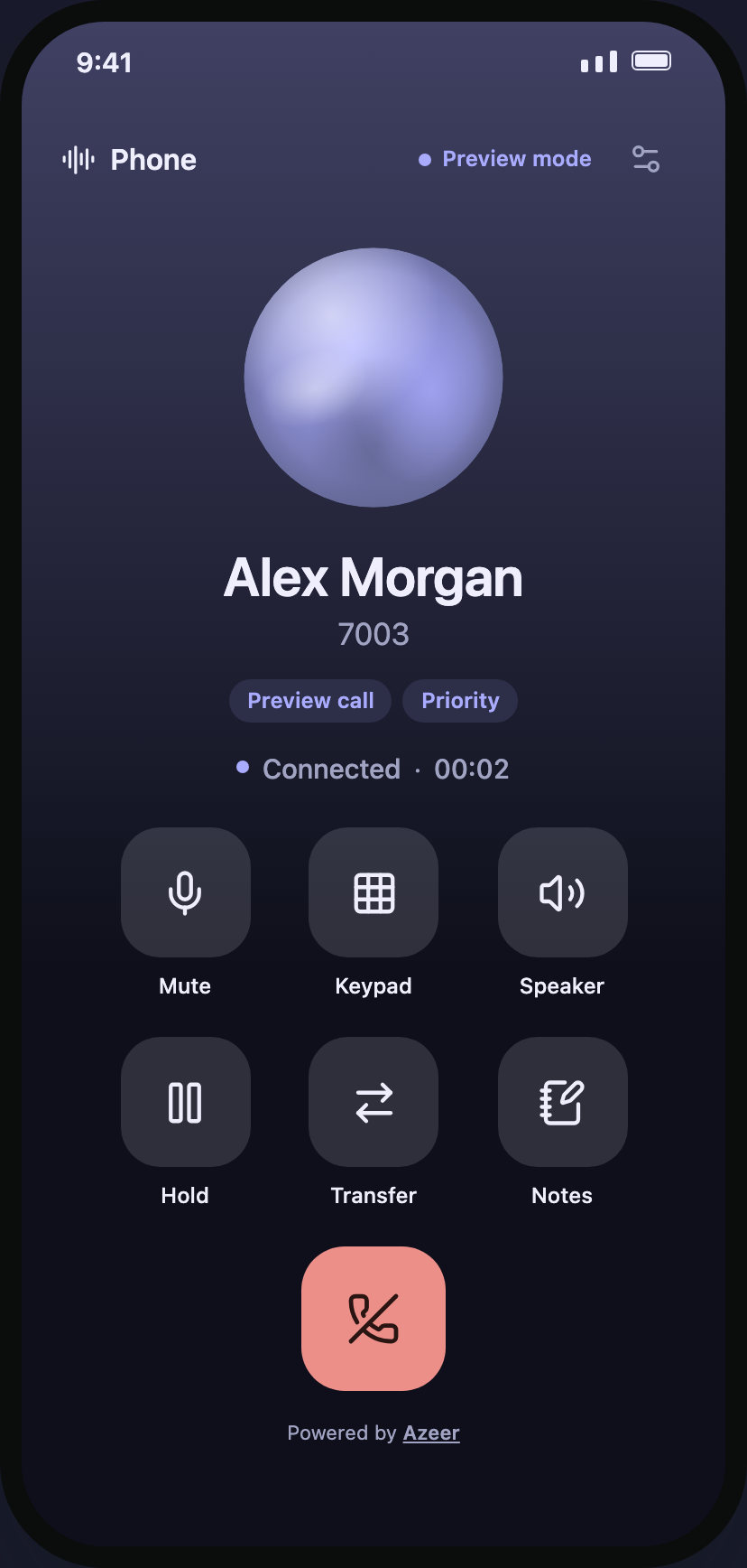
Presets
Section titled “Presets”Each preset has a tuned light and dark palette, so appearance: "system" keeps working. phoneThemes exports them if you want to build your own.
| Preset | Light accent | Dark accent |
|---|---|---|
forest |
#2e5945 |
#b8daa2 |
ocean |
#1f5fbf |
#8fbaf5 |
midnight |
#4b4fd1 |
#a9abff |
graphite |
#24282c |
#eceef0 |
sunset |
#b8482a |
#ffab8a |
lavender |
#6a4dd6 |
#c6b6ff |
Tokens
Section titled “Tokens”| Token | Default | Used for |
|---|---|---|
accent / accentForeground |
Preset | Selected states, links, highlights |
answer / answerForeground |
accent |
Answer, call, and slide-to-answer |
background / surface |
Preset | Screens and cards / buttons and fills |
foreground / muted / border |
Preset | Text, secondary text, dividers |
danger / dangerForeground |
Preset | End call, decline, errors |
keyBackground / keyForeground |
surface / foreground |
Keypad keys |
islandBackground / islandForeground |
Near-black / off-white | The collapsed island capsule |
controlShape |
circle |
Round buttons and keys (rounded squircles) |
radius |
20 |
Cards and sheets |
fontFamily |
System | All text |
Tints (selected states, decline fills, pressed keys) are derived from your tokens, and text on custom colours is chosen for contrast. Tokens are scoped per phone, so an island and a phone tab can differ. Use <PhoneRoot theme={…}> with usePhoneTheme() and controlRadius(theme, size) to style your own components consistently.
Languages and wording
Section titled “Languages and wording”Every visible string and accessibility label comes from labels. Pass the keys you want to change; everything else stays English:
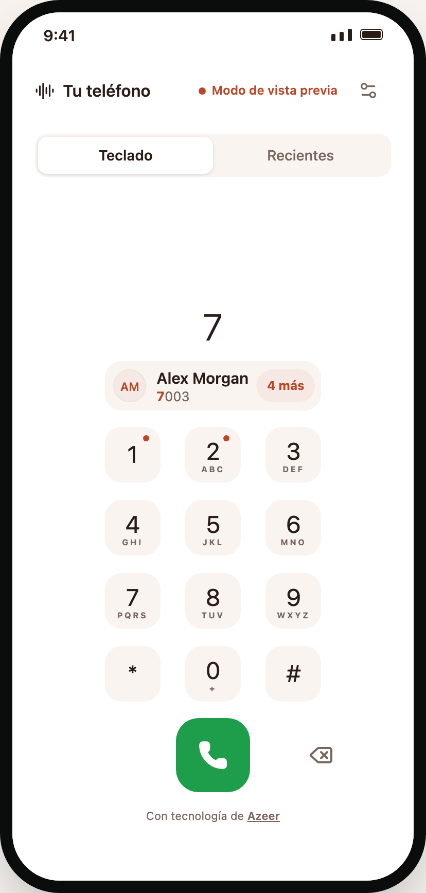
<SipPhone labels={{ answer: "Contestar", decline: "Rechazar", mute: "Silenciar", incomingCall: "Llamada entrante", callNumber: (number) => `Llamar a ${number}`, endReasons: { "Missed call": "Llamada perdida", "Call ended": "Llamada finalizada" }, }}/>defaultPhoneLabels lists every key (about 150, including the keypad, island, Recents, audio settings, and connection form). Parameterized strings are functions. endReasons translates the client’s readable end reasons (“Call ended”, “Missed call”, “Busy”, “No answer”, “Number not found”, …). Use usePhoneLabels() in your own components. Recents dates and times use the device locale automatically.
Number formatting
Section titled “Number formatting”import { parsePhoneNumber } from "libphonenumber-js";
<SipPhone formatNumber={(number) => parsePhoneNumber(number, "US")?.formatNational() ?? number} />;formatNumber changes how numbers are displayed (call screen, island, suggestions, Recents); it never changes what is dialed. Return the input unchanged for extensions and SIP addresses.
Caller identity
Section titled “Caller identity”caller describes the outgoing contact; resolveCaller enriches any incoming or outgoing caller (for example from your CRM) with name, avatarUrl, and tags. renderAvatar and renderTags replace those slots entirely. Incoming identity comes from the SIP From header; it is never invented.
Motion
Section titled “Motion”motion={false} or motion={{ durationMs: 180 }} (80–600 ms). Layout changes animate natively with LayoutAnimation; presses, rings, and visuals use the native driver. The system Reduce Motion setting always wins.
Accessibility
Section titled “Accessibility”- Every control has a label; toggles report selected state and the keypad toggle reports expanded state. On the web, the same state is exposed as ARIA (
aria-pressed,aria-selected,aria-checked,aria-expanded). - Status changes use live regions; errors are announced; incoming calls are announced without moving focus.
- Round controls are 56–80 pt; text respects Dynamic Type up to 1.6×.
- Slide-to-answer exposes an “Answer” action, and the volume slider is adjustable with increment/decrement actions.
- The island collapses with Android Back and the iOS escape gesture.